The following content may contain affiliate links. When you click and shop the links, we receive a commission.
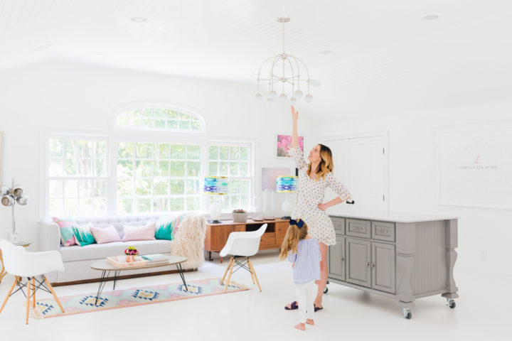
**Many thanks to Hudson Valley Lighting for sponsoring this post! As always, the thoughts and opinions expressed below are entirely my own.
I’ve been desperate for an upgrade in my studio space. When I was designing our house remodel two years ago, I was super pregnant with Major and just trying to make decisions that were neutral enough to get done in record time– and that I could always play around with later if I wanted. When I was designing my studio, I felt really stuck with the overhead light fixture. I couldn’t find anything I really loved, so I just picked out a piece that would more or less disappear. Over the past couple of years, I’ve been really lamenting the fact that it’s not very “statement”-y the way I’d like for such a focal point in the room. In other words, I’m ready for some DRAMAAA! Hahaha. So this summer, I decided to replace it, and give my studio a much-deserved glow up!
Before
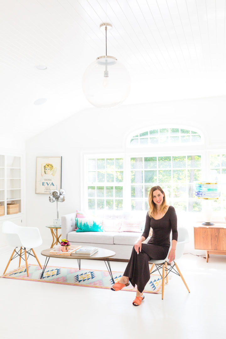
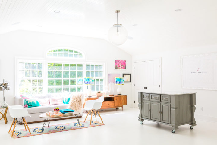
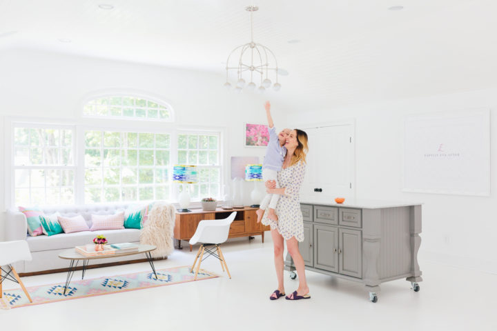
Picking a chandelier that you’re going to look at all day every day is no easy task. I wanted something gorgeous, modern, and feminine that would fit in my space, but something that also would be functional to give off beautiful light as needed. I do have events, meetings, and shoots in there all the time, after all! But it was not hard to fall in love with this beautiful chandelier from Hudson Valley Lighting!
After
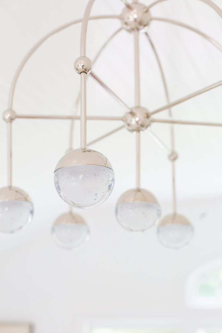
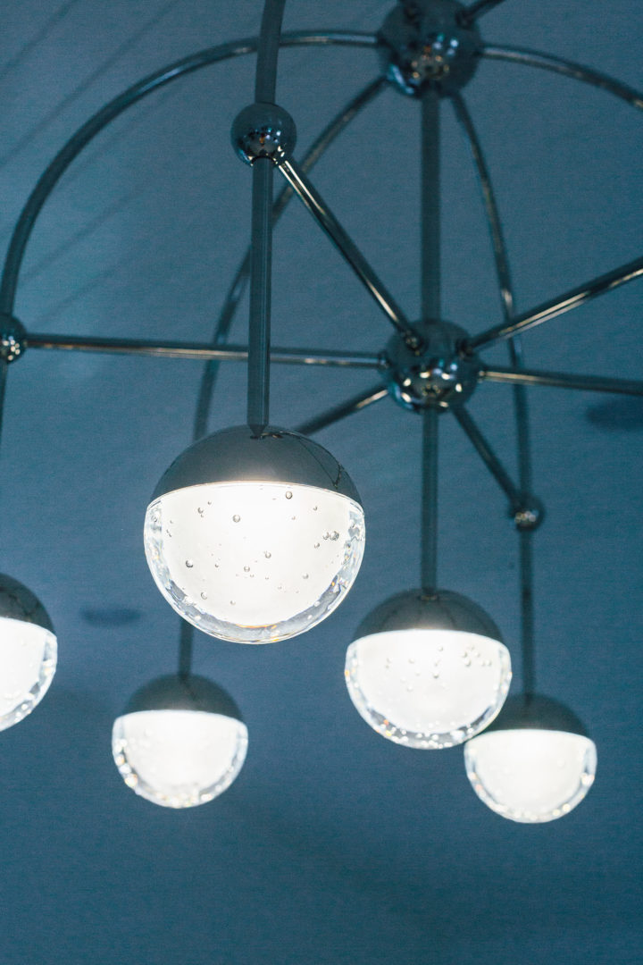
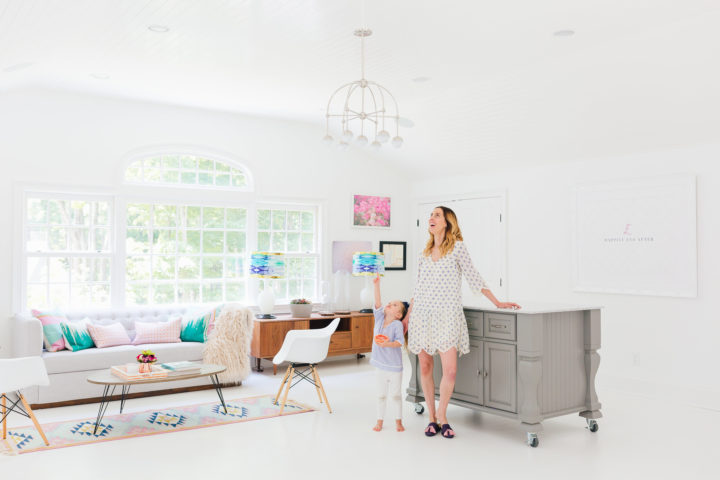
I love Hudson Valley Lighting because they have a really incredible lighting selection, across all different categories. It’s a real mix of styles and price points, and I love how easy it easy to comb through all the different options. Honestly, it was hard to pick just one! Ultimately, I loved the sleekness of this “Boca” chandelier in polished Nickel. It matches the hardware in the rest of the studio, and I really liked that it is delicate while also making a bold statement. By the way, for you brass lovers this comes in brass as well! When it was installed it really felt like it had been in there the whole time. I feel like that’s the true sign of a well-integrated design choice. Marlowe also loves it. She says it reminds her of the ocean because of the bubbles in the orbs. Actually, her exact words when she saw the studio for the first time after the installation were: “Mom, this place looks so GORGINA now!” LOL. Approved!
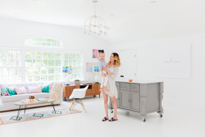
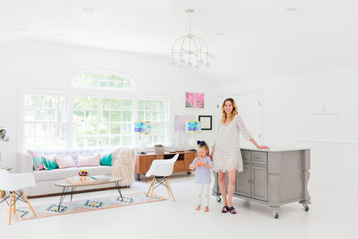
I love that my workspace feels a lot more special, and what I always wanted it to be from the beginning! Now I’m dreaming of all the other lighting glow-ups I want to do all over my home…isn’t it amazing how a little lighting change can really transform a room?
What would be the lighting you would upgrade in your space? Share in the Comments below!
Photographs by Julia Dags.
